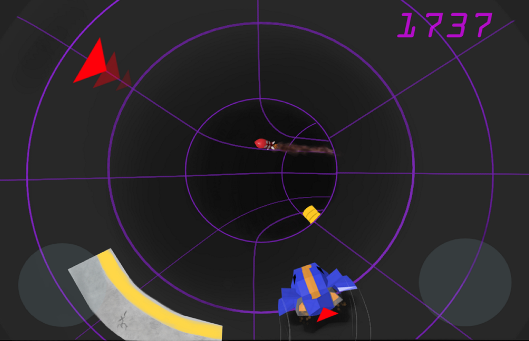
Realm Racer Devlog #6: Almost Ready for Alpha Build

     It’s been a long three months since our last update, but fear not. We did not go gentle into the good night. Far from it, in fact; we have been busy with many things.

     The main change in our lives is the hallmark out-of-college experience—we got full-time jobs. That’s what it means to be an adult, right? To bring home the bacon? Well, regardless of what being an adult truly means, getting a job and being financially grounded is important, especially in the independent gaming industry. Fortunately for us, work is fun. We work at a fabulous company called Rally as Fullstack Software Engineers. The work there is engaging and pushes us to learn new coding tools and techniques. Besides work, we play with the Rally soccer team too, and even managed to win the championship last season! The only downside to working is the 1 hour 30 minute commute, but we take advantage of that time by working on Realm Racer.


Alpha Build

     We are really excited about this one. Within the next month or two, we should have an alpha

Continue Reading

Creating our Logo

     A new logo is approaching (with a blog redesign)! One of the tasks on our Hack'n'Plan (a tremendous game planning web app, by the way) which wasn't directly connected to our game was designing a real logo for our studio, Elrel. Actually, many of you may not have heard of the word Elrel yet, because as far as this blog is concerned, it is only written in the footer. It is, however, our twitter handle and on the splash screen of our first game. The logo for our first game was rushed because we really wanted to release it. Thus, it was high time Elrel got a nice logo; one which can be easily recognized.

     I want to dedicate a whole entry to the logo's creative process because of this post, which highlights the creative process behind Tiny Phoenix's logo. Despite what some comments say, I think the logo is splendid, and I'm glad the team reached something they liked. Designing a logo is not easy, and I learned that first hand while making our logo. Not all of you will agree with the decisions we made, and some of

gateio

Tags

Realm Racer Devlog #5: Get some GUI

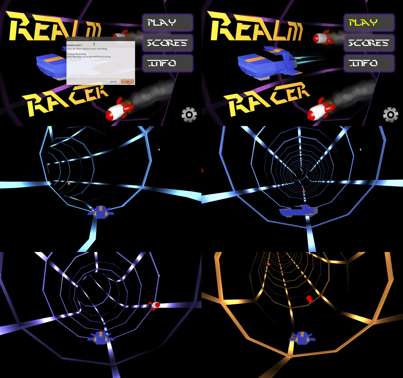
     This shouldn’t be very long. As Joraaver noted last week, I managed to design and integrate a decent looking Main Menu into the game. Voila:

main menu gifWe haven't done any loading screen, which is why you see a funny flash of the tube before the actual game appears.

     To be a little more technical, JME currently has 3 GUI systems in place, either with native support or actively supported by developers. These are: nifty GUI, tonegodgui, and Lemur. All three are fine options, but Lemur really shows a tremendous amount of flexibility for very complex GUIs (even 3D). Granted, our GUIs will be simple, but Lemur also boasts CSS like styling, with which I am quite familiar. For this game, we are using Lemur.

     Since I’m no UI/UX artist, I went looking for examples or information to help me get started. Here are some of what I found helpful:

Continue Reading

Realm Racer Devlog #4: Moving Rockets!

     Apologies for the now almost four-month silence. Suchaaver and I have been busy graduating from college, moving out of our apartments to back home, and taking a vacation. In fact, I write this article from our hotel room overlooking the beach in Waikiki, Hawaii. But we have an update that I’m glad I’ve gotten through, as it opens up the door for a lot of feature development. Behold, moving rockets as obstacles!

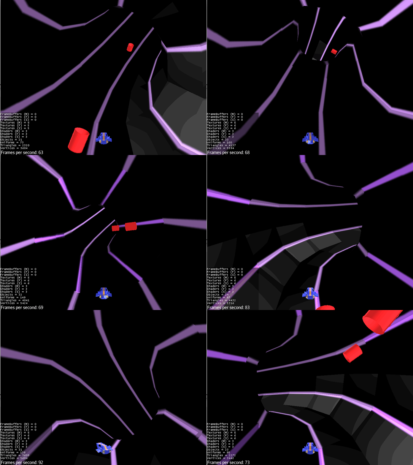
Rockets Zooming DemoNear miss with that second rocket.

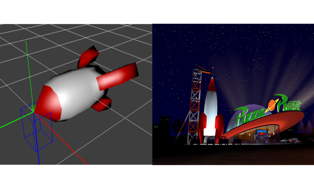
     Suchaaver modeled a nice prototype rocket for use in our game, and it is now our game’s first moving obstacle. The design of the rocket pays homage to old school spaceships (think Pizza Planet from Toy Story). It’s fun, a bit nostalgic, and most importantly, fits the feel of our game by having a low-poly style to match the player vehicle.

Rocket ComparisonGood ol' Pizza Planet providing some inspiration for that rocket.

What took so long?

     It took a lot longer than I anticipated to put the obstacle movement system in place. From the outset of this game, I knew I wanted to create

Continue Reading

Realm Racer Devlog #3: Finally, Shaders

It's the end of spring break for us, which means it's high time for another update. “Update” means pretty pictures, so a gif:

In this post I'll talk about the look development of the whole thing. So let's get started.

From Humble Beginnings

Last time you saw the game, it looked like this:

previous time

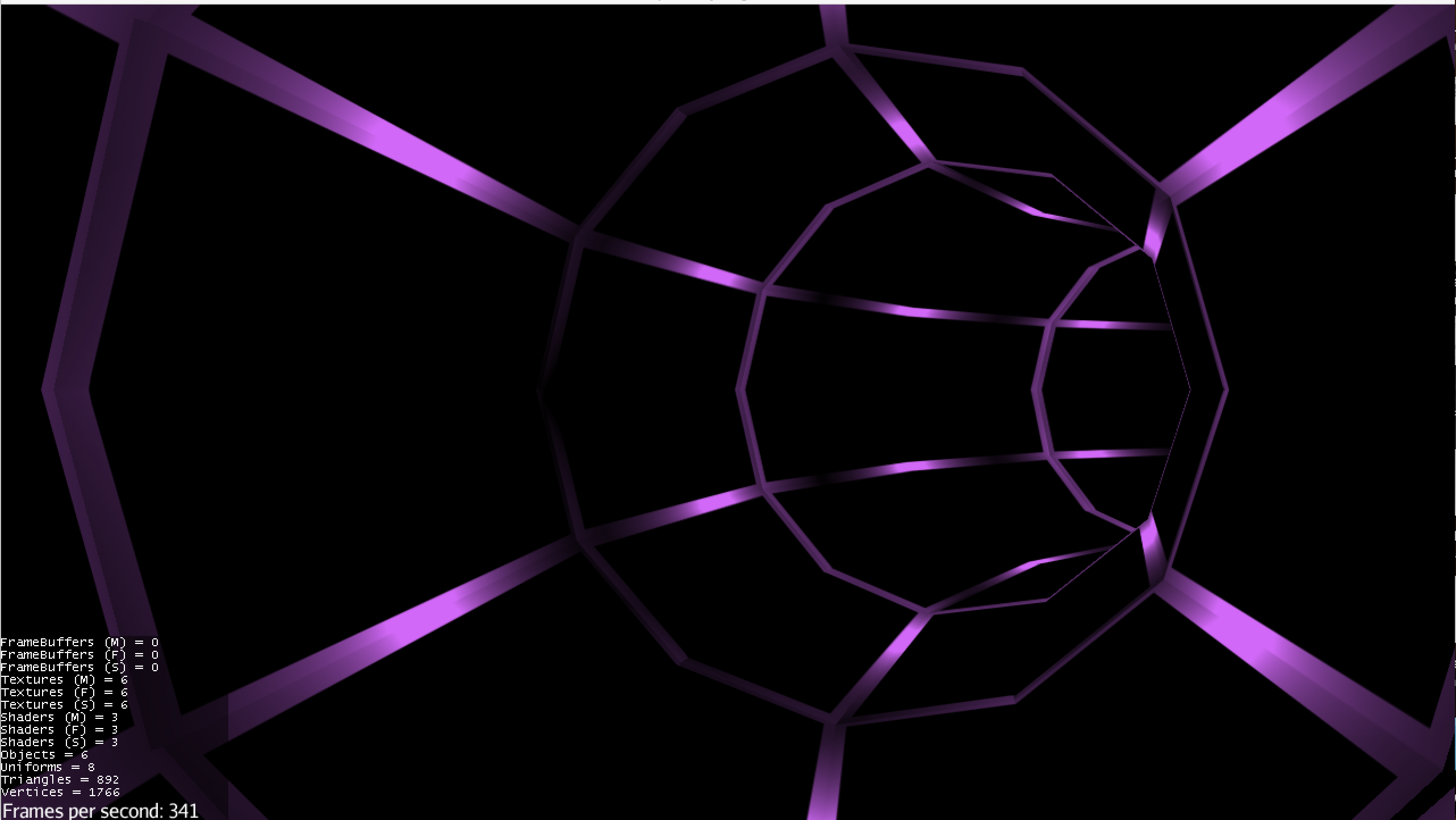
That art was more “placeholder” art. I wanted to make the player feel like he or she is moving very quickly through a tunnel with lights evenly spaced within. Thus, I needed the lines of the tube to darken and lighten evenly. I could have painted a diffuse/color map with light and dark areas, but I decided to lightmap it. Why? Well, 1) with actual lights generating the lightmap the result is more realistic, and 2) I wanted to learn the process.

So I went into Blender, set up a lighting scheme, rendered the textures, and plopped them into the game. The result was this:

LIGHTMAPPED

To me, this looked pretty good. But I was bothered by the fact that the lights weren't as bright as I wanted them to be. Something about lightmapping that I hadn't realized was that with basic lightmapping, things don't get brighter.

Continue Reading

Realm Racer Devlog #2: Aesthetics and Design Patterns

     We haven't done this in a while, but this post is going to present to you all the wonderful updates we have for our game!

     I'm quite happy with the progress we've made. It's been considerately motivating, applying different software engineering principles and seeing what a difference they make in game. I'll discuss what those changes are and reflect on why they've made me a better coder.


Aesthetics

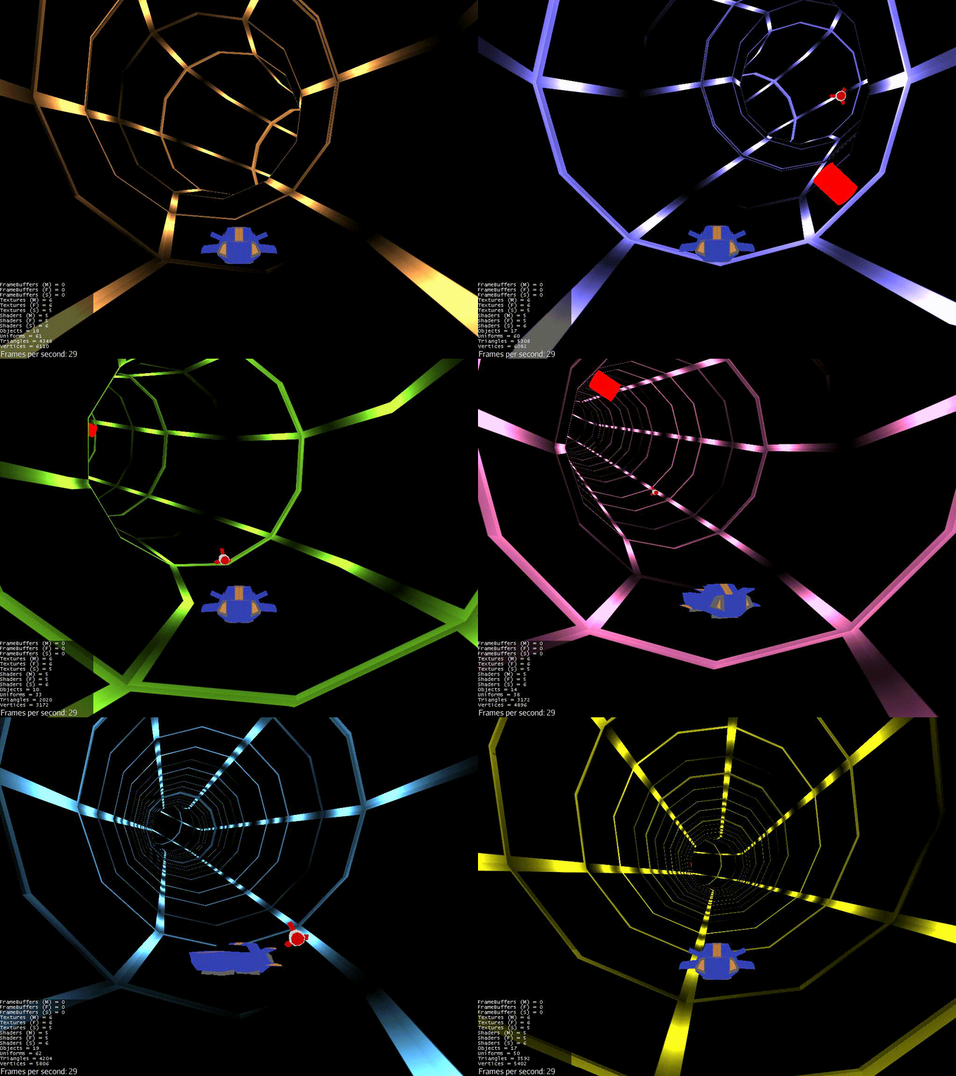
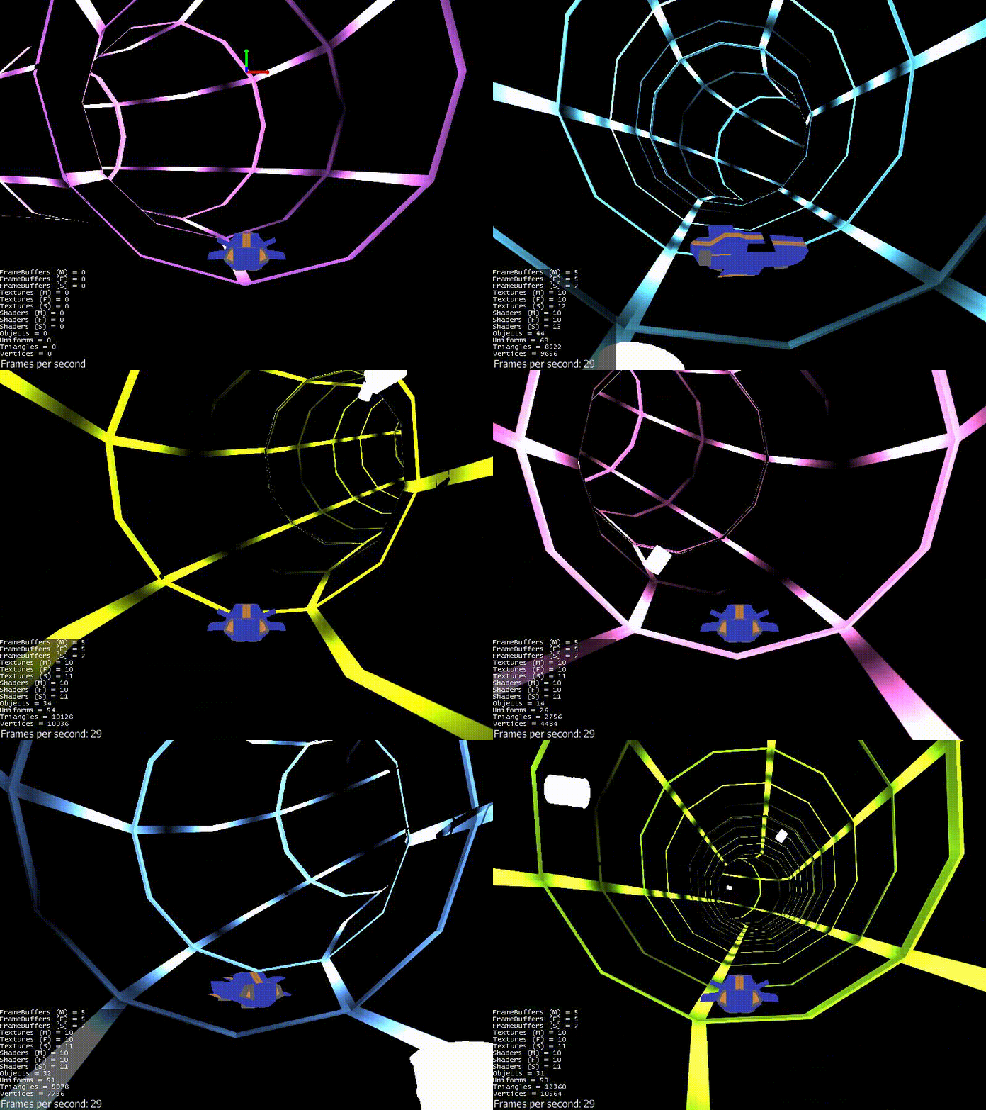
     The gif below sums up most of what the game looks like now:

gif of game

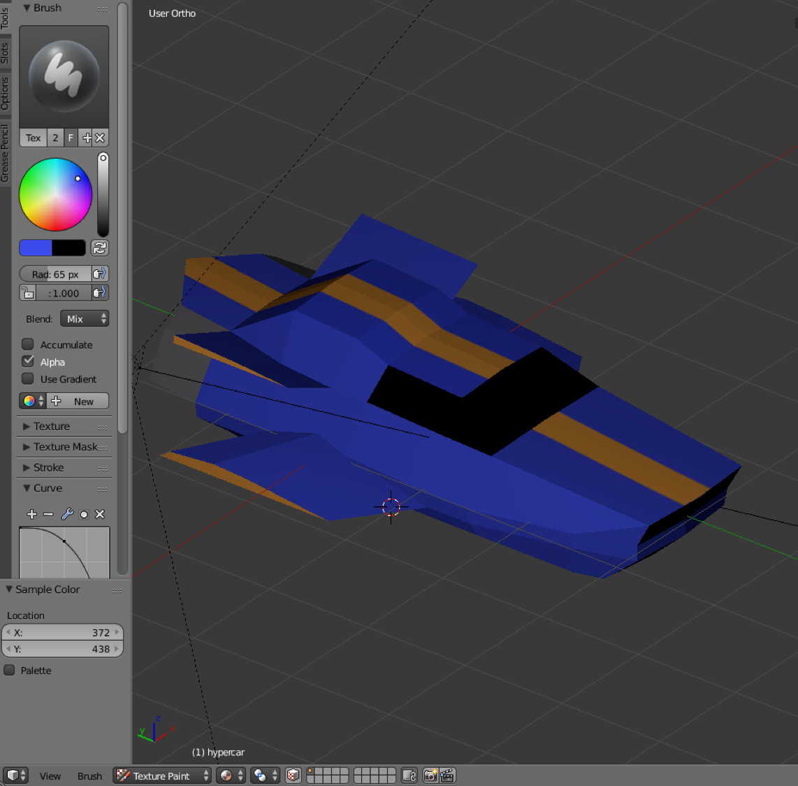
     The game has gone from just a bunch of debugging objects to actual art. We tweeted some concept art we had in mind for one possible slice of the game and have, to some degree, implemented that art. The tubes and the car currently reflect that. However,you'll note that the lines on the tube are very large. I had to perform some scaling due to nonstandard sizing of the models. Don't worry, I complained to our artist, and he says he has now standardized the sizes of all the models.

car model concept art      The gif doesn't

Continue Reading