I'm currently taking a Digital Animation course at Berkeley, in which I am learning 3D modeling and animation in Maya. I feel it is actually geared a little more towards understanding the pipeline for movie development (“Frozen” like stuff), but much of the pipeline is the same for game development (modeling, rigging, UV mapping/texturing, animation, to name of few parts). However, I want to discuss one specific aspect of the pipeline that I feel sometimes gets overlooked in the game dev world, especially when on an indie budget—character design.
A few weeks ago I went to a character design seminar the class set up to learn more about how professional artists create characters for Disney and other film studios, and how I can apply these concepts to my own characters (specifically, for the short our class is required to make). I want to share what I learned with you as well as examine other character designs, so you can learn how to create a character that burns its own image into the minds of your players.
Keep in mind that what I know about the process is more from the seminar than anything else. I'm not saying this is the right way, or the best way. It's just the way I learned about it. I might also pop in information about design techniques (i.e. thumbnailing) from other great sources (Ctrl+Paint, Concept Cookie, etc).
While character design is very much an art, it benefits greatly from methodical iterative prototyping. There are three steps in this design process:
- Research/Reference
- Reaction/Experimentation
- Intention → Decision/Design
Research/Reference
This is a first step for any aspect of design, be it website design, character concept art, etc. Gather information about the subject matter. Few people would be able to draw a capybara without doing a study, if it were somehow decided that the initial character were to resemble one. Look at images, videos, sculptures, etc. One item of reference the facilitators of the workshop told us to stay away from is other animations or games. We tend to not build our own style if we are referencing the style of other artists; our creativity is not pushed as hard if we are using the creativity of others.
A good thing to do with your references is put them all on one document (if they are pictures). This helps mold together the images in your mind, in order to come up with something unique.
Of course, if you have zero idea what your character should look like, then what do you gather reference of? That's a good question. Unfortunately, I don't have a rock solid answer, but I do have a suggestion. You should have a fair concept of your game if you are starting to do character design. Surely, as you imagined the game, a few fleeting ideas of a character came across your mind. Start with those. These can be insane, stupid ideas, but ideas are ideas nonetheless. If nothing ever came to mind, then start drawing first. If you draw, slowly and steadily, you will gain a more solid understanding of what you might be looking for. Once you have an idea, gather some reference.
Reaction/Experimentation
After gathering reference, you begin drawing (or modeling, if you are doing 3D or you are faster/better at designing that way). In the effort of creating a more memorable, dynamic character, this is not going to be a one-time process. Expect to iterate. It might take some time.
In order to get started in the right direction, it is generally good advice to do what many artists call “thumbnailing.” Essentially, the idea is to create many concepts of the subject in a certain amount of time. Artists who get really in the groove can pump out 20 thumbnails in an hour. However, this is not a quota thing. The idea is to get you thinking of different directions your character can take. The most important thing here is to not be constrained. Really push the design of your characters without caring about whether or not they look good. Your reference is a starting point, not the goal. So while your final concept might resemble the reference (a raccoon might still need to resemble a raccoon), it should also be something completely different. Sometimes, great ideas come out of “happy accidents” that occur when the brush is flying across the canvas. Our speaker encouraged this by requiring us to draw many sketches of a corgi using a thick black sharpie. In this way, we were thinking about noticeable shapes and outlines. We also used mistakes on the page as a guide to greater concepts.
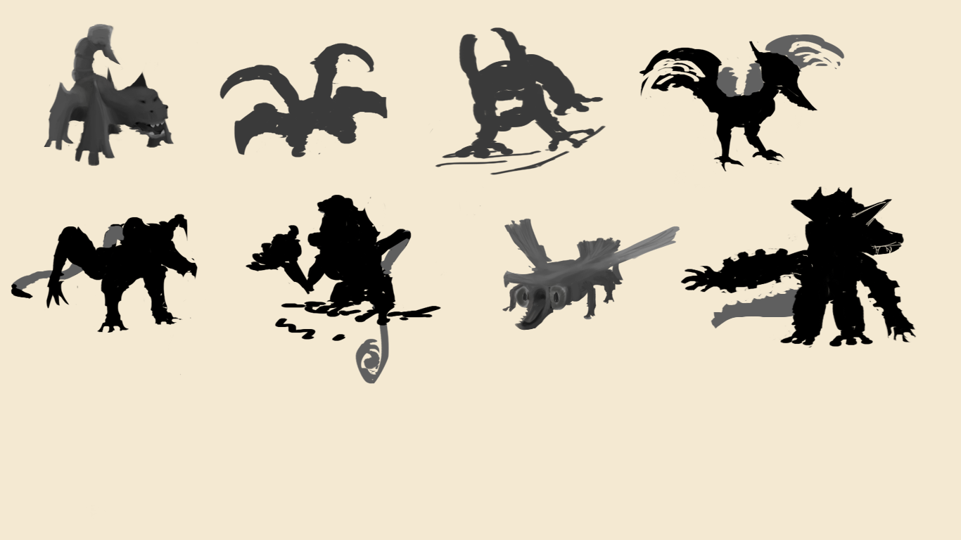
Some creature silhouette thumbnails
It also helps, when fleshing out a concept, to think of a story to fit your character. This could lend the character unique equipment or characteristics. It helps give your character “character," so to speak. For example, my capybara from before could have a scar over his right eye. All of a sudden, there is an unknown history to this little mammal. There are other real life examples as well.
Take Crash Bandicoot. Here is Crash, and here is an actual bandicoot. Take a good look.
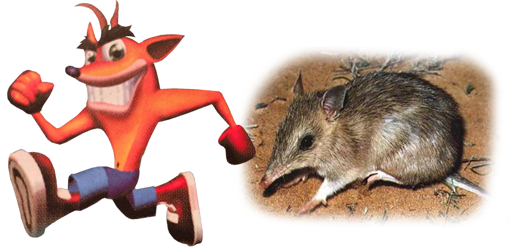
Not so similar, huh? The proportions of this character are not normal—for a human or for a bandicoot. Not to mention, Crash doesn't have a neck—but that doesn't concern us, does it? Granted, some of the design aspects were more to do with limited hardware than anything else (check out Andy Gavin's blog post for more). Still, we see the same theme with many game characters:
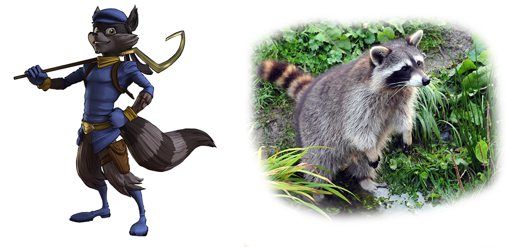
Sly Cooper
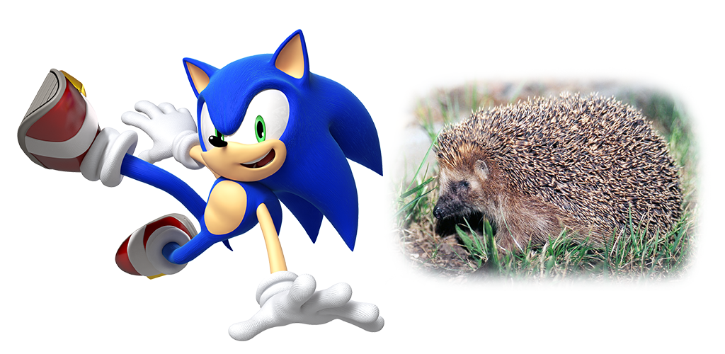
Sonic the Hedgehog
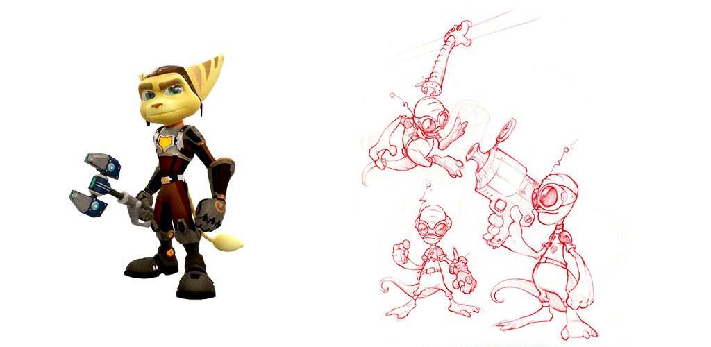
Ratchet and initial sketches
Ratchet is interesting. He is an alien, so actual photographic reference of his character was nonexistent. So what is that on the right? An initial sketch. Not quite the same, but as John Fiorito mentions on the Insomniac Games blog post, some of the characteristics drawn from Ratchet's story were present—the gadget glove, for example.
The takeaway from this section is:
- Iterate on designs
- Explore and be wild in the concepts.
- Use the character's story to inform your decisions.
Intention → Design/Decision
After coming up with a few good concepts, the most important thing to do is to test if they really work. Some ideas that look great on paper turn out to not work so well in a game environment. Once again, I would like to turn your attention to Crash Bandicoot. Some smaller details needed to be changed to achieve a proper in-game look. For example, Andy noted that the small amount of ankle showing below the pants looked less like legs in game and more like flickering orange pixels. Thus, Crash had shorter pants. The little things matter.
A rough, rigged 3D model of your character should give a pretty good idea of how well it works in game. Certain character proportions make certain actions surprisingly difficult (i.e. turning Crash's head without an actual neck). The same goes for 2D (Crash in a 2D side-scroller has the same challenge of looking back while running forward).
Basically, it boils down to this: if in-game testing proves that the character needs tweaking, go back and tweak it. Otherwise, if all is well, move forward. In other words, iterate.
Conclusion
With any luck, you picked up a thing or two on character design from this article. I'd love to hear what you guys think about character design, in games or in general. One more thing I'd like to mention is that the process shouldn't be tiresome. It should be fun and engaging. If the character your team settles on is boring, the whole production of the game will be boring. Make it fun.
P.S. I definitely recommend checking out Matt Khor on Ctrl+Paint and the wonderful guys at Concept Cookie. They have information both towards the technical drawing aspect of design as well as stuff regarding the broader aspects of creation.
