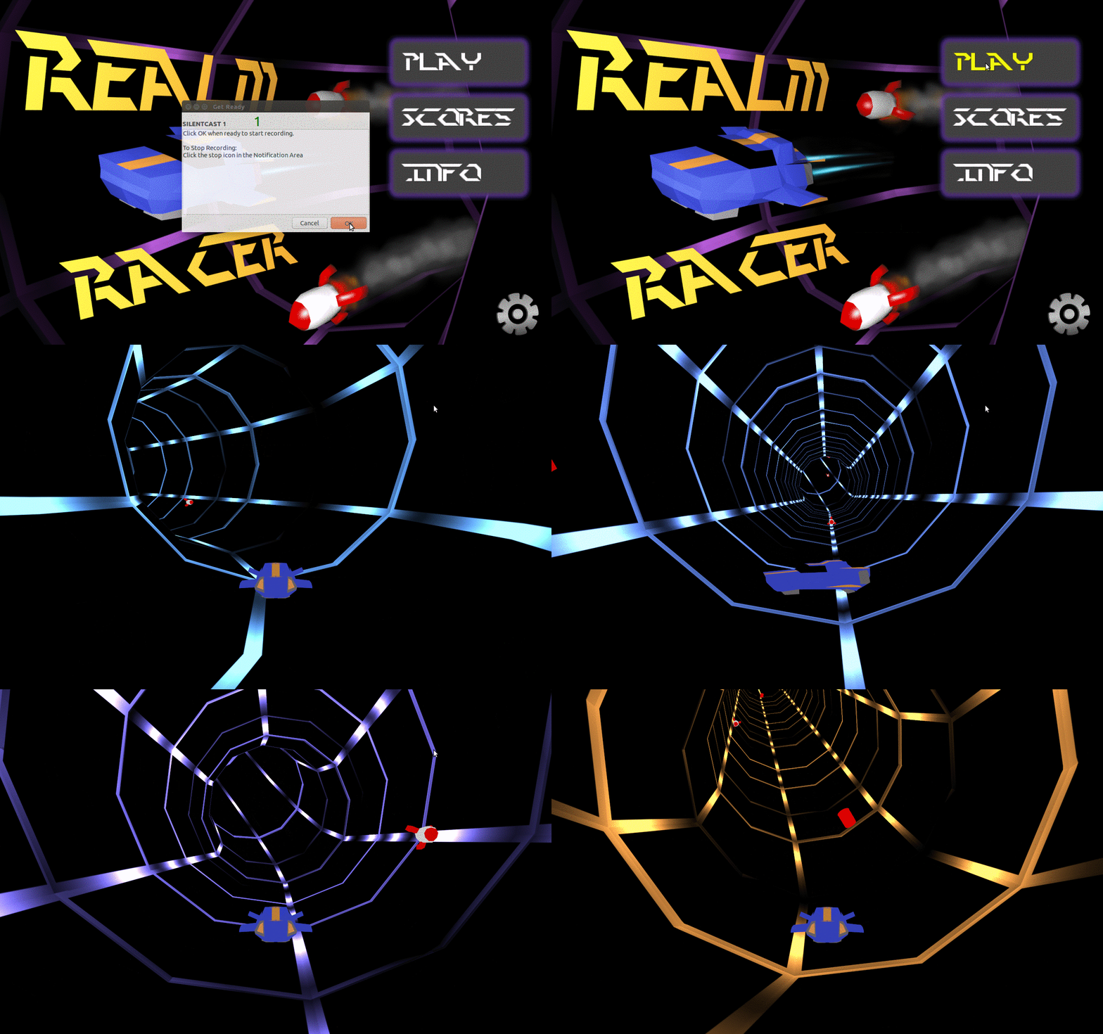
This shouldn’t be very long. As Joraaver noted last week, I managed to design and integrate a decent looking Main Menu into the game. Voila:
 We haven't done any loading screen, which is why you see a funny flash of the tube before the actual game appears.
To be a little more technical, JME currently has 3 GUI systems in place, either with native support or actively supported by developers. These are: nifty GUI, tonegodgui, and Lemur. All three are fine options, but Lemur really shows a tremendous amount of flexibility for very complex GUIs (even 3D). Granted, our GUIs will be simple, but Lemur also boasts CSS like styling, with which I am quite familiar. For this game, we are using Lemur.
Since I’m no UI/UX artist, I went looking for examples or information to help me get started. Here are some of what I found helpful:
- http://gamesinspiration.com/ Provides a tremendous number of mobile game screenshots for references
- http://gameuis.com/ Similar concept, but not just mobile games. Still a new site, thus the library isn’t large.
- What Players Want A rather in-depth look at how UI is a part of the player experience.
Like I said, I’ll keep this short. Keep devving!
